Logo Design, Brand Design
White SpaceLogo & Brand Design
Brand & Logo Concept
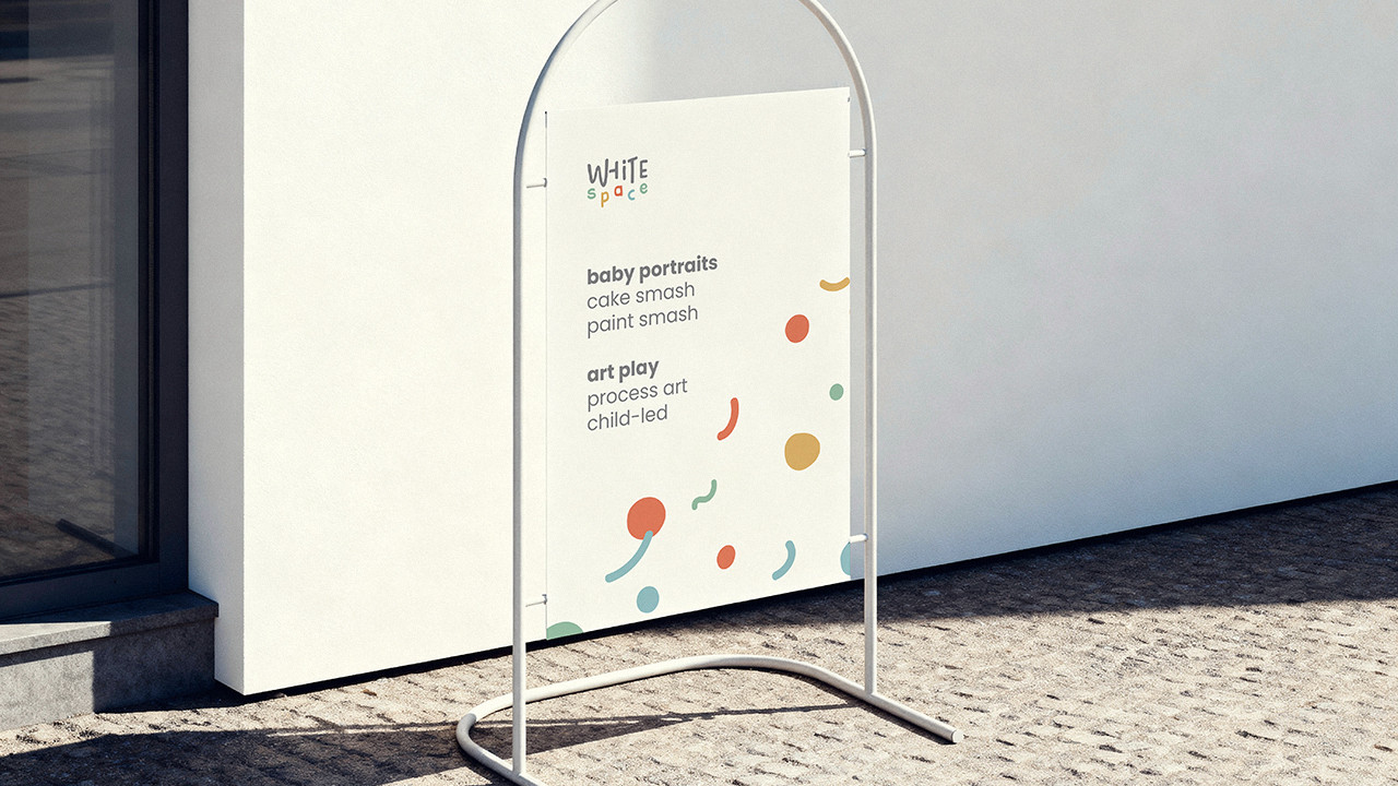
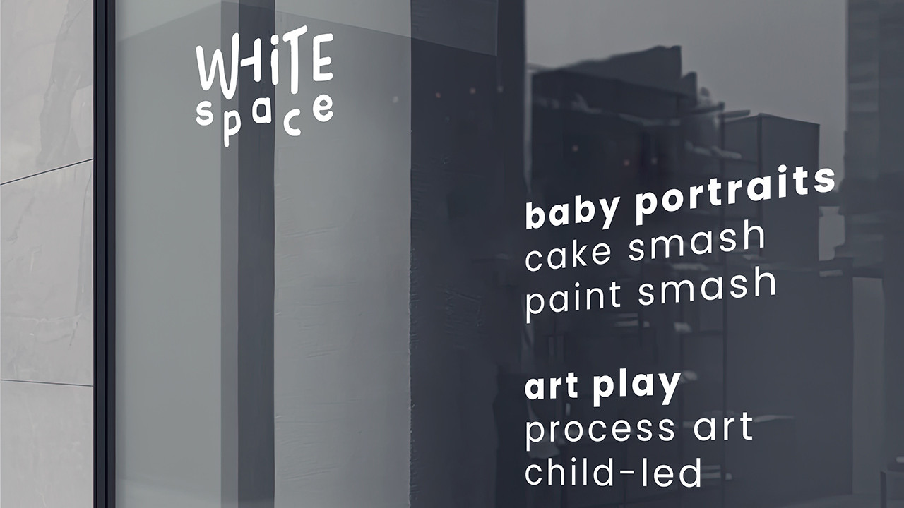
White Space is a studio dedicated to capturing the beauty of early childhood. Specialising in baby portraits and art play sessions for toddlers, the studio is designed as a place where creativity, curiosity, and joyful moments naturally unfold.
The name White Space reflects both the physical environment and the philosophy behind the brand. The studio features a clean white setting — white walls, white floors, and a calm, open space. This blank canvas allows colours, emotions, and children’s expressions to come to life.
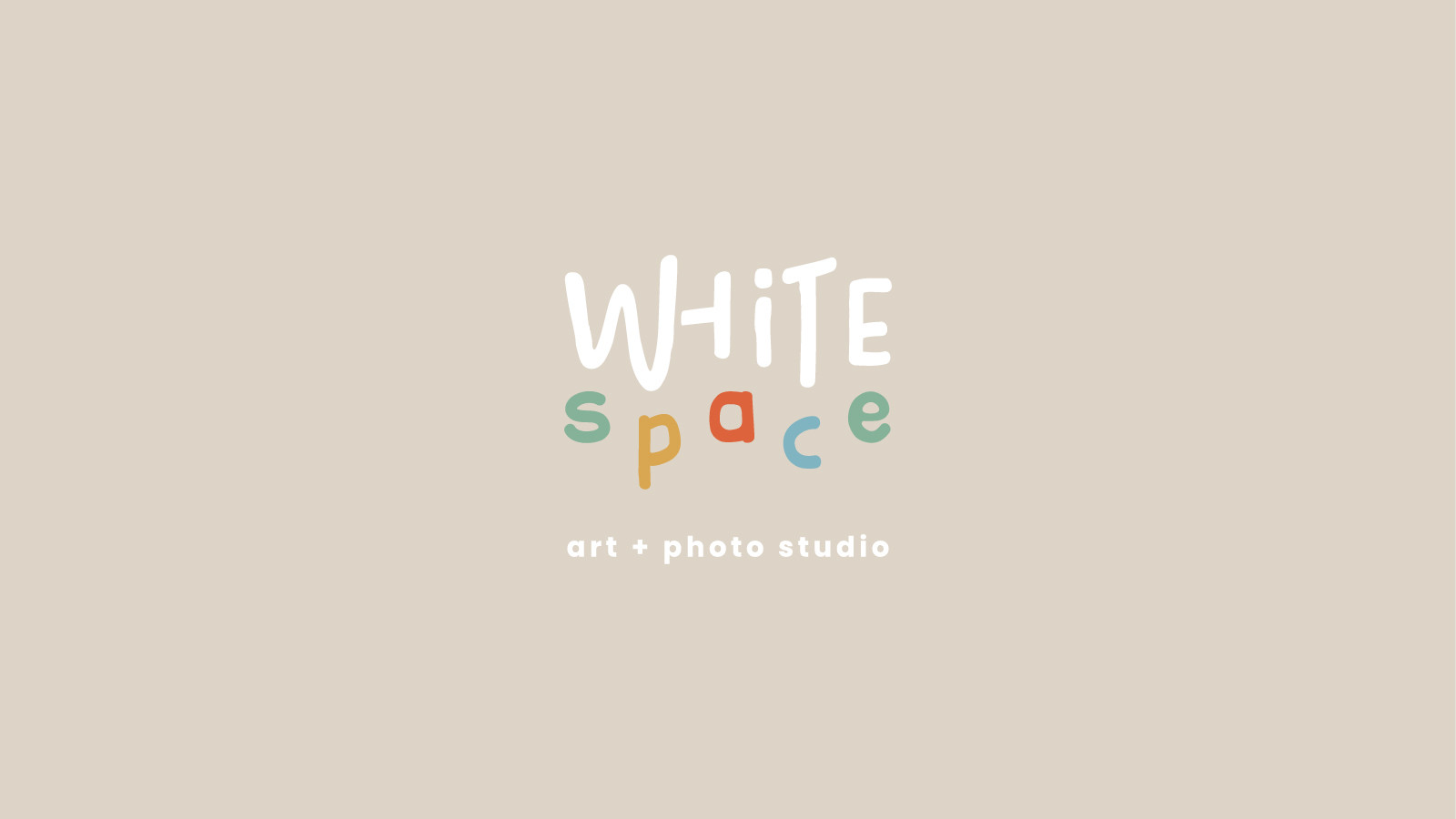
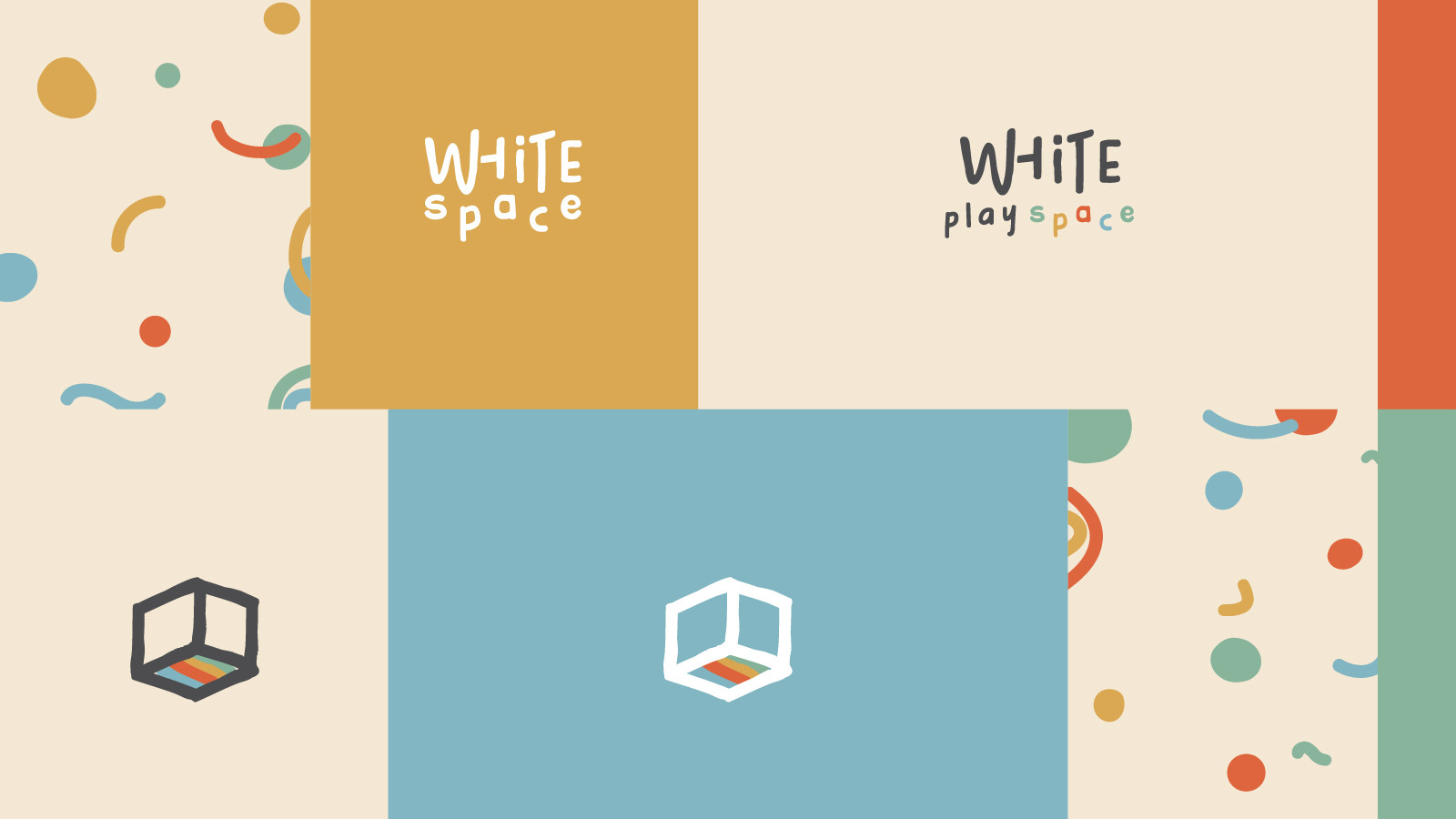
The Logo
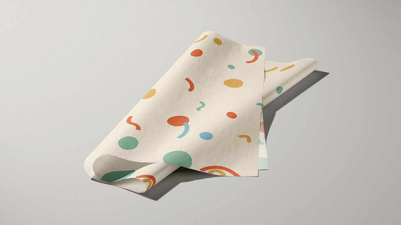
The logo is created in a hand-written style, giving it a warm, personal, and artistic feel. It reflects the spontaneity and authenticity of childhood — imperfect, playful, and full of character.
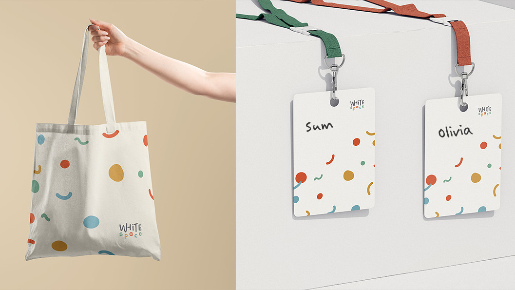
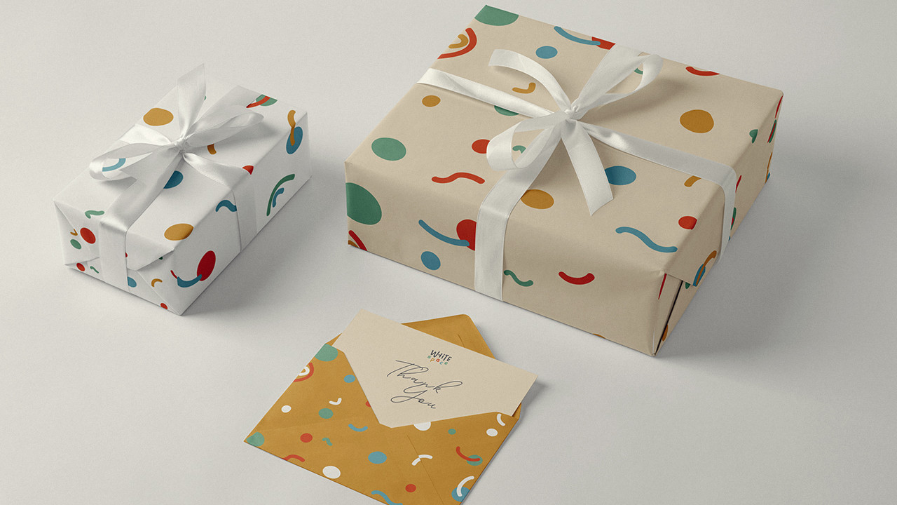
The Brand Colour
The brand colour palette includes green, yellow, orange, and blue. These vibrant colours represent joy, richness, imagination, and the lively energy of children. They symbolise creativity in motion — paint on paper, tiny hands exploring textures, and the colourful moments captured in photography.
White remains the primary colour of the brand, representing openness, calmness, and possibility. Within this white space, colour becomes the storyteller. The colourful elements — through photography and art play — fill the space with life, laughter, and memories.
In essence, White Space is a blank canvas where children’s colourful moments unfold.